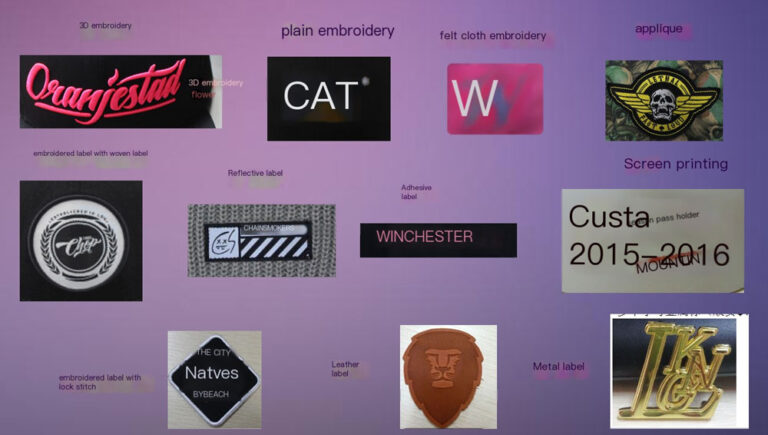
Customers often send me a design and ask: “Can this logo be done in 3D embroidery?” The logo covers almost the whole front panel, the lettering mixes thick and thin strokes, and there are lots of small cut-out areas inside.
I first look at the logo’s structure, then consider the cap style, the fabric, and any finishing treatments. From a cap development view, there are four main factors.

1. The width of the thinnest stroke
3D embroidery puts foam under the thread, and the thread covers it to create a raised look. If the lettering is very thin, the foam and thread take up space from the original outline. This can cause rounded edges, unclear sharp corners, and bare spots where the fabric shows through.
2. Enclosed spaces in letters and shapes
Letters like A, R, P and O have closed areas inside. If those areas are too small, the foam and covering stitches shrink them further, and they can even close up. For complex logos, use 3D embroidery on the thick main strokes and flat embroidery for the fine details. This keeps visual depth and stops the details from crowding together.
3. Cap style and embroidery position
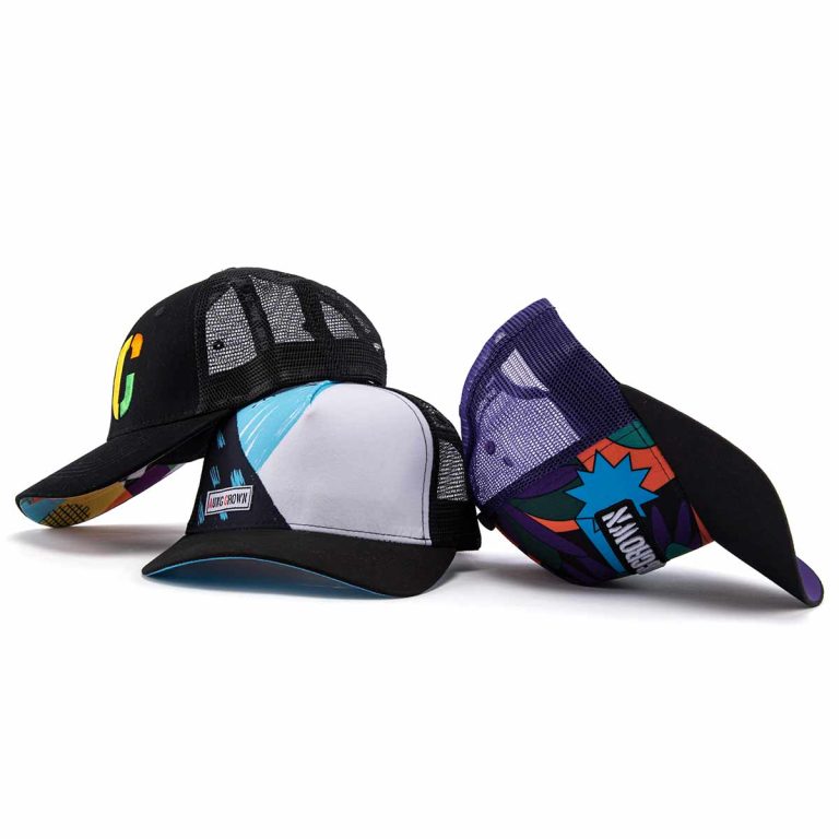
The front of a baseball cap is not a flat surface. A six-panel front is curved and has a seam in the center. When placing the embroidery, consider the curve, the seam position, how the cap is held in the embroidery frame, and the logo’s visual center. If you position it only from a flat design file, the logo can end up off-center or look uneven from left to right.
4. Fabric and finishing
- Velluto a coste: The pile has height, so you need the right backing and enough stitch coverage so the thread doesn’t sink in.
- Tessuto elastico Control the fabric tension during embroidery to reduce distortion afterward.
- Very thin nylon: Watch for needle holes, puckering, and the choice of backing.
- Light thread on dark fabric: Do a test sample to check that the dark color doesn’t show through.
If the cap will later be washed, stone-washed, or enzyme-washed, test the process in advance.
Different needs call for different techniques
- Basic brand style (small letters, simple shapes): Flat or 3D embroidery. Focus on clear lettering, clean outlines, and good proportion to the cap.
- Trendy designs (large artwork, graffiti, gradients): Consider printing, appliqué, or a mix of embroidery and printing.
- Small test batches: Consider heat transfer or printing, depending on how complex the artwork is. Also compare screen or setup fees, sampling fees, quantity, and cost per cap. Printing is not always cheaper.
- Long-term products: Focus on process stability, durability, and consistency across mass production.

The hardest part of logo work is not choosing between flat and 3D embroidery. It is turning your design file into an embroidery file that works for cap production. How to split the lettering, which direction the stitches run, where to adjust stitching, and how thick the foam should be all affect the final result.
If you’re not sure which technique to use, talk to your factory.

Ho oltre 25 anni di esperienza nella produzione di cappelli e abbigliamento. Con un approccio costante e attento ai dettagli, supervisiono la produzione in fabbrica e le attività del team, garantendo una qualità affidabile e consegne puntuali ai clienti di tutto il mondo